A colorful personal travel business card Template is useful for independent travel advisors, tour planners, travel writers, destination specialists, guides, and other professionals who want a compact way to introduce their services. Unlike a generic business card, a travel-focused design can communicate a sense of movement, discovery, destination expertise, and personality through color, typography, maps, aircraft symbols, luggage motifs, routes, or destination-inspired imagery. The strongest designs balance visual energy with practical information, so the card feels distinctive without becoming difficult to read.
The search intent behind this topic is broader than finding one attractive design. People usually want to understand what information belongs on a personal travel card, how colorful layouts should be organized, which file format is appropriate, how to adapt a design for printing, and how to choose between editable design tools and document-based formats. Existing travel card examples commonly use world maps, aircraft, destination imagery, bright color blocks, curved shapes, and compact contact sections. Those patterns provide useful inspiration while still leaving room for a distinctive personal identity.

What makes a colorful personal travel business card effective?
The defining characteristic is not simply the number of colors. Effective color comes from a deliberate visual hierarchy. A card might use a warm yellow with turquoise, a coral accent with blue, or several restrained shades around a neutral background. The important point is that the palette should support the identity of the travel professional. A luxury itinerary planner may need a sophisticated palette even when using several colors, while an adventure specialist can usually tolerate stronger contrast and more playful graphic elements.
Color should also help readers understand the card at a glance. The name, professional title, business name, telephone number, email address, website, and social handles should remain visually distinct from decorative elements. If every section receives a different bright color, the design can become noisy. A better approach is to select one dominant color, one supporting color, and one or two accents, then reserve the strongest contrast for the information that matters most.
Travel symbolism works best when it reinforces the person’s actual service. An airplane can immediately suggest flights or international travel, while a globe communicates worldwide destinations. A compass can suggest itinerary planning or exploration, and a suitcase can imply practical trip organization. These symbols should not overwhelm the contact information. The purpose of the card is to make the person easy to remember and easy to contact, with the travel theme supporting that objective.

Essential information to place on the card
A personal travel card normally works best when it answers three questions quickly: who are you, what do you do, and how can someone contact you? The name should usually receive the strongest typographic treatment. A short role such as “Independent Travel Advisor,” “Travel Planner,” “Destination Specialist,” or “Tour Consultant” can immediately establish context. If the person operates under a recognizable brand, the brand name can sit alongside or above the professional title.
Contact information should be limited to details that are genuinely useful. A phone number, professional email address, website, and one or two relevant social profiles are often sufficient. If a QR code is used, it should lead to something valuable, such as a portfolio, booking page, itinerary inquiry form, or professional website. Adding every possible contact channel can make the card look crowded and can reduce the visual impact of the colorful design.
The reverse side provides additional space when the front becomes too busy. Instead of repeating the same details, it can contain a short service statement, destination specialties, a simple world-map graphic, a QR code, or a compact list of services. For example, an independent advisor might use the front for identity and contact information and the back for “Custom itineraries,” “Family trips,” and “Destination planning.” This division keeps each side purposeful without requiring tiny text.

Choosing colors that communicate a travel personality
Color psychology should be treated as a design consideration rather than a rigid formula. Blue is frequently associated with sky, water, reliability, and calm, making it a natural foundation for many travel concepts. Green can suggest nature and outdoor experiences, while orange and yellow can create a warmer, energetic impression. Pink, coral, and purple can produce a more expressive identity when the target audience or personal brand supports that direction.
A colorful personal travel business card Template does not need a rainbow palette to appear colorful. A two-color design with a bold accent can feel more polished than a design containing many unrelated shades. One practical method is to start with a travel-related image or brand color, extract two supporting tones from it, and then introduce a neutral background. This approach helps the typography remain readable while still giving the card visual personality.
Contrast matters particularly when a card will be printed. Very pale text on a saturated background can become difficult to read, especially at small sizes. Likewise, thin decorative lines that look elegant on a screen may lose clarity in physical production. Before finalizing the design, inspect the smallest text at actual card size rather than relying only on a large screen preview.
Layout ideas for independent travel professionals
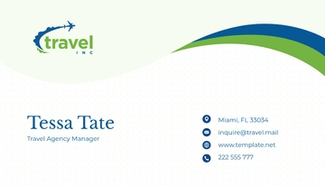
A horizontal layout is familiar and gives the designer enough room to establish a clear hierarchy. One side can place the name and title in a strong text block, while the opposite side contains contact details and a small travel symbol. Color bands, curved shapes, or a map section can create visual movement without interfering with readability. This format is particularly suitable when the person wants the card to feel professional but still approachable.
A vertical layout can make the card feel more editorial and distinctive. It works well when the design relies on a tall destination photograph, a large initial, a stacked name, or a narrow route illustration. The main risk is overfilling the available space. The designer should establish the name and role first, then fit only the contact details that are essential to the intended networking situation.
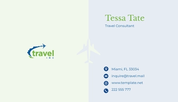
A two-sided design can provide the most flexibility. The front can function as a memorable identity panel, while the back becomes an information panel. For a travel specialist, the second side could include a small destination map, service categories, a QR code, or a short statement describing the type of journeys planned. The key is to make the two sides feel like parts of the same brand rather than unrelated cards.
Using maps, routes, and destination graphics
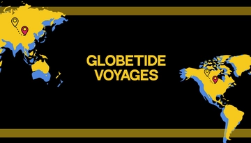
World maps are among the most recognizable visual devices for travel-related branding. A map can occupy an entire background, appear as a faint watermark, or become a small accent behind the professional title. The best treatment depends on the density of the other information. A detailed map behind small text may create visual interference, whereas a simplified silhouette can communicate the same travel association with much greater clarity.
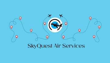
Route lines are another useful device because they communicate movement without requiring a photograph. A dotted flight path, curved itinerary line, or sequence of location markers can make a static business card feel dynamic. Route graphics are especially appropriate for people who specialize in custom itineraries, multi-destination journeys, travel planning, or destination coordination.
Destination imagery should be selected carefully. A beach photograph may immediately suggest leisure travel, but it could be misleading for someone who specializes in business trips, cultural tours, hiking, or expedition planning. When an image is used, it should reflect the actual service identity. A simplified graphic often works better than a generic stock photograph when the card needs to remain personal and versatile.

Typography and readability
Typography is the stabilizing element in a colorful design. Decorative lettering can work for a name or short brand phrase, but the practical information should usually use a clean and highly legible typeface. A useful hierarchy might contain one prominent name style, one supporting role style, and one simple contact style. This prevents the card from looking like several competing designs placed together.
Font size should be judged at physical output size. Contact details that appear comfortably readable on a monitor can become too small when printed. Long website addresses and social handles are especially vulnerable because they contain many characters. If a web address is difficult to fit, a shorter branded domain or QR code can reduce clutter without removing the digital connection.
Spacing is equally important. A colorful card needs enough empty space around the name, logo, and contact details so that the eye can separate one information group from another. Decorative elements should not touch text unless the overlap is intentional and remains legible. Consistent alignment also creates professionalism even when the palette is playful.

Choosing a file format for editing and printing
People searching for a colorful personal travel business card template free often want a design that can be adapted quickly without rebuilding every element. The important consideration is not the label attached to a resource but whether its editable elements, dimensions, typography, and export settings match the intended use. A template should be checked for the ability to replace placeholder names, contact information, colors, graphics, and logos.
Someone searching for a colorful personal travel business card template free download may be specifically looking for an editable file rather than a static picture. That distinction matters. A preview image is useful for inspiration, but it is not necessarily an editable source. Before choosing a resource, check the actual file type and whether the design elements remain separately editable.
A colorful personal travel business card template canva search reflects a different workflow. Browser-based design editors are useful when a person wants to adjust colors, typography, imagery, and layout visually. A colorful personal travel business card template pdf is more appropriate when the priority is a fixed layout for viewing or production. A PDF generally preserves the visual arrangement more reliably than an editable document, although editability depends on how the file was created.

Word and Google Docs workflows
A colorful personal travel business card template google docs can be useful for people who prefer working inside a familiar document environment. The challenge is maintaining precise positioning. Business cards depend on exact alignment, repeated spacing, and consistent sizing, so document-based designs should be checked carefully before production. Text boxes, tables, shapes, and page margins can all influence how the final design behaves.
For users who specifically search for a colorful personal travel business card template word, the main advantage is accessibility and familiarity. A Word-based layout can be practical for simple cards containing a logo, name, title, and contact details. However, complex graphics may be less convenient to manage than in a dedicated design environment. A colorful personal travel business card template word free should therefore be judged by editability and print accuracy rather than by its label alone.
A colorful personal travel business card template for word is especially suitable when the user needs to update information repeatedly, such as changing a phone number, destination specialty, or service description. Before production, print a test page and inspect the alignment of multiple cards. If the layout shifts between pages or printers, simplify the design or move the final production stage to a format better suited to fixed-position artwork.

Printable layouts and physical production
People looking for a colorful personal travel business card template free printable are usually concerned with producing physical cards from an existing layout. The design should therefore be evaluated at its intended physical dimensions, not simply as a digital rectangle. Standard business-card dimensions vary by region and printer, so the safest approach is to follow the specifications supplied by the chosen print provider.
A colorful personal travel business card template printable should include sufficient breathing room around text and important graphics. If the design extends to the edge, the artwork may need to continue beyond the final trim area according to the printer’s specifications. Keeping critical information away from the edges reduces the chance that slight cutting variation will affect readability.
Color management is another practical consideration. Bright colors can look different on screen and on printed stock, particularly when a monitor is highly saturated. A test proof is useful when brand colors are important. Paper finish also changes perception: glossy stock can emphasize strong color and photographs, while matte stock can provide a softer, more understated appearance and may be easier to read under direct light.
How to make the card feel personal rather than generic
The strongest personal travel cards contain a recognizable point of view. Instead of simply placing an airplane icon beside a name, consider what makes the professional’s service different. A destination specialist might highlight a region, a travel planner might emphasize customized itineraries, and a travel writer might prioritize a portfolio address. The visual language should reinforce that distinction.
Personalization can also come through restrained details. A signature color, distinctive monogram, custom route illustration, memorable tagline, or destination-inspired pattern can make a template feel less generic. These elements should be consistent with the person’s broader identity so the business card connects naturally with a website, social profile, proposal document, or itinerary.
The card should still work when viewed without explanation. A recipient should be able to identify the person’s name, profession, and contact path without needing to ask what the graphics represent. A strong travel aesthetic is valuable, but clarity remains the foundation of effective professional communication.

Common design mistakes to avoid
One frequent mistake is treating every available design element as essential. Maps, airplanes, luggage icons, destination photographs, QR codes, logos, social icons, slogans, and multiple contact channels can all be individually useful, but placing them together can overwhelm a small card. Choose a primary visual idea and let the other elements support it.
Another mistake is prioritizing color over contrast. A vibrant background can make a card memorable, but if the name or contact information disappears into it, the design fails its practical purpose. Test text against the actual background and simplify the background when necessary. The most important information should always have a clear visual path.
It is also risky to rely on placeholder information for too long. Before production, check every name, title, telephone number, email address, website, social handle, QR code, and location. A visually polished card containing incorrect contact information can create more problems than a simple card that is completely accurate.
Practical Solution
Start by defining the professional identity before editing the design. Write down the name, role, business name if applicable, primary contact method, website or portfolio, and the service category you want people to remember. Then choose one visual direction: global travel, tropical travel, adventure, luxury journeys, destination planning, or another clearly defined theme. This prevents the card from becoming a collection of unrelated travel symbols.
Next, establish a simple hierarchy. Put the name and role in the most visible area, place essential contact details in a predictable location, and reserve the strongest color contrast for those elements. Add one meaningful travel graphic rather than several competing illustrations. If a QR code is needed, test it at the final printed size and make sure surrounding elements do not interfere with scanning.
Finally, inspect the design in three forms: a normal screen view, a full-size print proof, and a reduced visual preview. The screen view reveals spacing and typography problems, the proof exposes physical-size and color issues, and the reduced preview shows whether the identity remains recognizable at a glance. This simple workflow turns a template into a more intentional professional asset.
For someone searching for a colorful personal travel business card template download, the practical priority should be the source file’s actual capabilities rather than the wording used to describe it. Confirm whether the design can be edited, whether its dimensions suit the intended printer, and whether fonts and graphic elements remain usable. For someone in Britain searching for a colorful personal travel business card template uk, the same principles apply, with particular attention to the dimensions and production specifications of the selected print provider.

Matching the design to different travel roles
An independent travel advisor benefits from a design that combines personality with trust. A bright but controlled palette, clear title, and compact contact section can communicate approachability while preserving professionalism. A destination specialist can use a map or regional motif, while a luxury planner may choose richer colors and restrained typography instead of highly playful graphics.
Tour organizers and guides can use stronger visual cues because their services often revolve around experiences and destinations. A route line, compass, landscape illustration, or destination image can make the card immediately recognizable. The important distinction is between an image that describes the service and one that merely looks attractive.
Travel writers, bloggers, photographers, and creators may want the card to function partly as a portfolio invitation. In that situation, the website or portfolio destination can become the primary call to action. A QR code can be helpful, but it should complement a visible web address rather than replace every readable contact path.
Evaluating a template before using it
Before committing to a design, inspect whether the placeholder text can be replaced without disturbing the composition. Look at the longest likely name, the full professional title, and the actual contact information. If the template only works with very short text, it may require substantial redesign. A good template provides enough flexibility for real information.
Examine the visual balance at both sides of the card. A front design that looks excellent on its own may feel disconnected from a back design that uses different colors, typography, or imagery. The two sides should share recognizable brand elements. Consistency does not require identical layouts; it requires a common visual language.
Also check whether the imagery is suitable for the intended brand. A tropical beach design may be excellent for leisure travel but inappropriate for a corporate travel consultant. A global map may fit an international advisor but say little about someone specializing in local cultural experiences. Relevance is more valuable than visual spectacle.

Using the card as part of a larger brand
A business card becomes more useful when its visual identity matches other professional materials. Use related colors on the website, itinerary documents, email signature, social profiles, and presentation materials. Consistency makes the individual easier to recognize when a recipient encounters the brand again in another context.
The same principle applies to typography. A distinctive display font may work well for the person’s name on the card, but the broader brand should not depend on an overly decorative typeface for every communication. Supporting typography should remain readable across documents and digital screens.
Imagery can provide another consistent connection. A travel professional who uses simplified maps and route lines on the business card can repeat those motifs in itinerary covers or social graphics. Someone who uses destination photography can establish a recognizable image treatment across other materials. The goal is not to make every item identical, but to create a coherent visual identity.
Final checks before production
Read every piece of text slowly rather than relying on visual familiarity. Check spelling, capitalization, punctuation, phone numbers, email addresses, web addresses, and social handles. If the card includes a QR code, test it with more than one device when possible. A card can look perfect while containing a small but consequential error.
Inspect the margins and edges at actual size. Important text should not sit dangerously close to the trim area, and decorative artwork intended to reach the edge should be prepared according to the printer’s specifications. If several cards will be placed on a sheet, check the spacing between repeated cards and verify that the layout remains consistent across the entire page.
Finally, ask whether the design communicates one clear idea within a few seconds. A recipient should recognize the person, the travel connection, and the best way to make contact. If those three elements are obvious, the colorful treatment has achieved its purpose rather than becoming decoration for its own sake.

Reference Examples
The following visual references show how travel-oriented business cards can approach color, hierarchy, imagery, and information placement in different ways. A colorful personal travel business card Template can range from bright destination imagery to restrained geometric layouts, and the examples are useful because they demonstrate how the same basic communication task can be solved through different visual systems. When comparing designs, pay particular attention to the relationship between the name, role, contact information, logo area, and travel motif. A strong reference is not necessarily one to copy; it is one that helps clarify which elements make a personal travel card memorable and practical.
These examples also help with evaluating proportions and visual balance before creating a personalized version. Some emphasize photography, others use maps or travel symbols, while others rely mainly on color blocks and typography. Together they demonstrate why a good colorful personal travel business card Template should be judged at its intended physical size and in the context of the professional identity it represents. Use the references to compare front-side hierarchy, contrast, information density, graphic simplicity, and the amount of empty space available for comfortable reading.

Tropical Travel Agency Business Card Template
Source: MyCreativeShop

Family Friendly Travel Tours Business Card Template
Source: MyCreativeShop

Adventure Guided Tours Business Card Template
Source: MyCreativeShop

Bus Tours Business Card Template
Source: MyCreativeShop

European Guided Vacations Business Card Template
Source: MyCreativeShop

Elegant Bed & Breakfast Business Card Template
Source: MyCreativeShop

Guided Vacations Business Card Template
Source: MyCreativeShop

Hotel & Lodging Business Card Template
Source: MyCreativeShop

Water Park Business Card Template
Source: MyCreativeShop

Vacation Home Rental Business Card Template
Source: MyCreativeShop
