A home marketing tri fold brochure Template is a compact way to organize property information, brand messaging, photographs, features, contact details, and a clear next step within a six-panel printed layout. For real estate agents, brokers, developers, builders, and property marketers, the format works particularly well when a reader needs enough information to understand a home without being overwhelmed by a long sales document. The strongest designs treat the brochure as a guided sales conversation: the cover creates interest, the inside panels explain value, and the final panel makes it easy to contact the appropriate representative.
Searchers looking for a tri fold brochure template are usually trying to solve one of several practical problems. They may need a layout that can be adapted to a particular listing, a document that works in a familiar editing environment, a printable format, or visual inspiration for a professional real estate campaign. The important point is that a template is only the starting structure. The finished brochure should reflect the property, audience, brand identity, and marketing objective rather than simply reproducing a generic arrangement.
Current real estate brochure examples commonly combine large property photography with short feature lists, agency information, neighborhood details, service descriptions, QR codes, maps, testimonials, and contact information. Template libraries also show that tri-fold designs are used for individual homes, property portfolios, agencies, open houses, developments, and broader real estate services. That flexibility makes the format useful, but it also means that choosing the right content hierarchy matters as much as choosing attractive colors or typography.
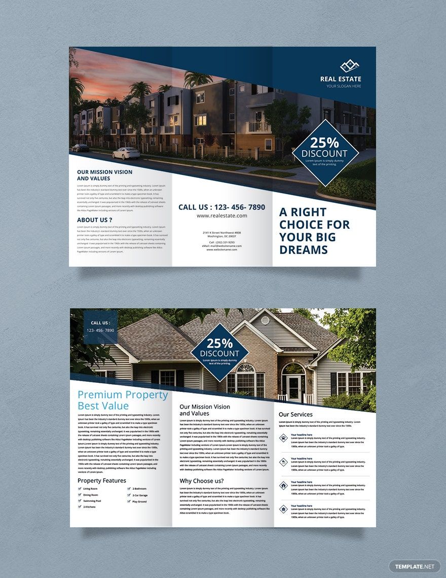
What a Home Marketing Tri-Fold Brochure Should Accomplish
The primary job of a property brochure is not to say everything about a home. Its job is to present the most persuasive and decision-relevant information in an order that is easy to scan. A potential buyer should quickly understand what property is being promoted, why it deserves attention, which features distinguish it, and how to continue the conversation. A well-planned tri-fold format creates six connected panels, giving the marketer enough room for a concise narrative without turning every section into dense blocks of text.
A useful structure usually begins with a strong cover. The cover can feature the home’s best exterior image, a concise positioning statement, the property address or development name, and the identity of the agent or company. Inside panels can then move from property highlights to supporting information such as rooms, amenities, location advantages, floor-plan information, or neighborhood characteristics. The back panel can contain contact information, a QR code, social channels, office details, or a concise call to action.
The format is particularly effective when each panel has a distinct purpose. A common mistake is to fill every available area with copy, logos, icons, and photographs. That makes the brochure visually noisy and weakens the reader’s ability to identify the most important information. Stronger layouts deliberately leave breathing room around headings and photographs, use consistent alignment, and establish a clear distinction between primary information and secondary details.

The brochure should also work as a physical object. Text that looks comfortable on a large monitor may become difficult to read after printing and folding. Panel widths, fold positions, margins, image resolution, and type size therefore need to be considered before the copy is finalized. A layout that respects the physical reading experience usually feels more polished than one that was designed solely as a flat digital graphic.
For listings with substantial visual appeal, photography should lead the hierarchy. For an agency brochure, branding and services may deserve greater prominence. For a development, maps, amenities, unit types, and lifestyle information may be more useful. The right structure depends on the marketing objective, so the same underlying tri-fold format can support very different campaigns.
Examples from real estate template libraries illustrate several approaches, from highly photographic layouts to designs dominated by typography and structured feature panels. The best choice is not necessarily the most elaborate design. It is the design that makes the intended information easiest to understand while maintaining a credible visual identity.

Planning the Six Panels Before You Edit the Design
Before opening a layout, write a panel-by-panel content plan. Think about the brochure as a sequence rather than six unrelated rectangles. One possible sequence is cover, property overview, key features, location and lifestyle, agency or service information, and contact details. Another may use the interior spread for several listings while reserving the back panel for contact information. Planning first prevents the common problem of discovering near the end that an important item has nowhere to fit.
The cover should normally have one dominant message. A large photograph paired with a short headline is often stronger than several competing headlines. The headline can communicate the property’s positioning, such as a focus on modern architecture, family living, waterfront surroundings, central location, or investment potential. The exact wording should be supported by the property itself rather than relying on exaggerated claims.
The first interior panel should answer the question, “What is this property and why should I keep reading?” Include the property type, broad location, major selling points, and a concise description. Avoid writing a long narrative that repeats the same facts found elsewhere. Instead, use the available space to establish context and create a logical bridge to the detailed features on the following panels.
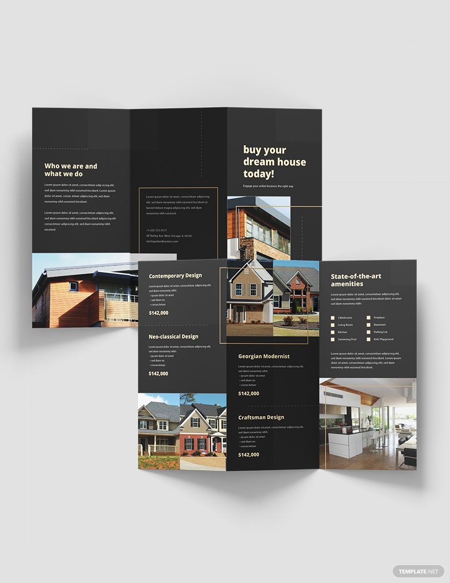
The middle panels are ideal for information that benefits from comparison or scanning. Bedrooms, bathrooms, parking, outdoor spaces, kitchen features, energy features, views, storage, and nearby amenities can be presented as concise lists. If a floor plan is available and visually legible, it can occupy a dedicated area rather than being reduced to an unreadable miniature.
The final panel should make the next action obvious. Contact details need to be large enough to locate quickly and should be consistent with the information used elsewhere in the campaign. If a QR code is included, give it enough surrounding space and explain what the code leads to. A QR code without context can look like decoration rather than a useful navigation element.
This panel strategy also makes the brochure easier to adapt. If the property changes, the listing details can be replaced without rebuilding the entire visual system. If the same brand promotes multiple homes, consistent panel roles can create a recognizable family of brochures while allowing each property to retain its own imagery and selling points.
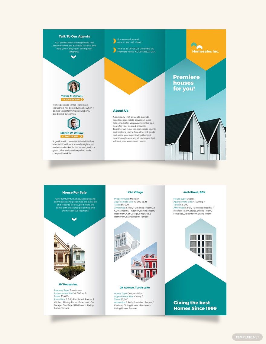
Choosing the Right Visual Hierarchy
Real estate brochures depend heavily on visual hierarchy because photographs often communicate the character of a property faster than paragraphs can. Start with the image that best represents the home’s overall appeal. This is usually an exterior view, but a distinctive interior, architectural detail, garden, pool, or view can be more appropriate when it communicates the property’s strongest advantage.
Supporting images should answer questions rather than merely fill empty space. A kitchen photograph can reinforce an amenity claim. A floor plan can clarify room relationships. A neighborhood map can explain location. An image of an outdoor area can support a lifestyle message. When every photograph has a purpose, the brochure feels informative rather than ornamental.
Typography should establish a clear order between the property name, major headings, feature labels, supporting text, and contact information. Two complementary typefaces can be sufficient, although a single well-chosen family can also produce a sophisticated result. Avoid using numerous font styles simply because the editing interface makes them available. Consistency usually produces greater perceived quality.

Color should reinforce the property’s positioning and the brand rather than compete with the photography. A restrained palette can make high-quality property photographs stand out. Dark backgrounds can support luxury-oriented imagery, while lighter layouts can create a contemporary or approachable impression. Whatever palette is selected, contrast must remain strong enough for comfortable reading in print.
Whitespace is another important design tool. Empty areas are not necessarily wasted space. They separate groups of information, protect photographs from visual clutter, and help readers identify where one message ends and another begins. A brochure that contains fewer elements but gives each element adequate space can often feel more premium than a brochure packed with content.
Real estate examples show how different visual systems can work: some rely on strong geometric blocks, some use large uninterrupted photographs, and others use modular grids for multiple properties. These approaches are useful references, but they should be treated as design inspiration rather than instructions to reproduce another creator’s work.

Writing Property Copy That Fits a Tri-Fold Layout
Writing for a brochure is different from writing a property listing page. Space is limited, so each sentence should contribute either information, positioning, reassurance, or a clear next step. Begin with verified facts and then turn those facts into concise benefits. For example, instead of repeating that a home has large windows, explain the practical effect when it is supported by the property details, such as abundant natural light or a strong connection between interior and exterior spaces.
Feature lists work particularly well because readers can scan them quickly. A concise group might cover bedroom count, bathroom count, parking, outdoor space, floor area, kitchen equipment, storage, and notable architectural features. Do not manufacture benefits that are not supported by the property information. If a feature is uncertain, leave it out or verify it before publication.
Location copy deserves the same care. Instead of vague statements about a “perfect neighborhood,” identify useful categories such as nearby transit, schools, shopping, dining, parks, employment areas, or major roads when those claims have been verified. Location information can be one of the most persuasive parts of a brochure because buyers are evaluating not only the building but also the surrounding environment.

Agency copy should also remain focused. A short description of experience, services, local knowledge, or specialization can establish credibility, but a long corporate history usually distracts from the property. The brochure should help the reader understand why contacting the agent is useful, not simply repeat the company’s internal mission statement.
Testimonials can add social proof when they are genuine and authorized for publication. Keep them short enough to scan and identify them accurately. If testimonials are unavailable, use the space for useful property information rather than inventing praise. Credibility is more valuable than decorative persuasion.
When the brochure is intended for an open house, event details should receive visual priority. Include the date, time, location, and any relevant visitor information in a clearly identifiable block. When the brochure is intended as a listing handout, emphasize the home’s identity, features, and contact pathway instead.

Using Word, Google Docs, Canva, and PDF Workflows
People searching for home marketing tri fold brochure template google docs are often looking for a familiar editing workflow that does not require specialized publishing software. A document-based workflow can work for straightforward brochures when the layout uses simple text boxes, images, shapes, and columns. The main challenge is maintaining precise alignment and panel dimensions while keeping the design stable during editing.
A search for home marketing tri fold brochure template word reflects a similar need. Word can be practical when the brochure is primarily informational and the user already understands its page-layout controls. However, highly graphical designs with overlapping shapes, complex image masks, or sophisticated typography may be easier to maintain in a dedicated design environment.
For people seeking home marketing tri fold brochure template canva, the appeal is usually the visual editing workflow and the ability to adjust images, text, colors, and layout elements in a browser-based design environment. The key consideration is not the brand of the editor but whether the chosen format preserves the intended panel arrangement and produces a sharp result when printed.

A home marketing tri fold brochure template pdf can be useful when the priority is preserving a finished layout for viewing or printing. PDF is generally better treated as a final-output format than as the primary editing environment unless the chosen workflow specifically supports structured PDF editing. Before sending a finished brochure to print, inspect the exported pages carefully to make sure photographs, fonts, margins, and fold positions appear as intended.
The phrase home marketing tri fold brochure template word free reflects a desire to minimize cost while using a familiar document editor. Cost, however, should not be the only selection criterion. Check whether the layout is genuinely editable, whether the panel arrangement matches your intended paper size, and whether the included imagery and design elements can legally be used for the planned purpose.
A query such as home marketing tri fold brochure template download often indicates that the searcher wants a ready-made file rather than design advice. The important evaluation criteria remain the same: inspect the format, page dimensions, editability, licensing terms, image quality, and whether the layout actually suits residential property marketing.

Print Preparation and Panel Accuracy
A brochure can look excellent on screen and still produce disappointing print results if the physical specifications are ignored. Confirm the finished paper size before editing, then verify the page orientation and panel arrangement. Tri-fold brochures are commonly prepared as landscape sheets that fold into three vertical panels, but the exact setup depends on the printer and paper size.
Pay close attention to the fold areas. Text, logos, faces in photographs, QR codes, and important visual details should not sit directly on a fold. Keep essential information comfortably inside the safe area. If a background photograph crosses a fold, check that the transition still looks intentional after folding rather than accidentally cutting through a focal detail.
Photographs should be large enough for the intended physical dimensions. Enlarging a small web image can create softness or visible artifacts. Property photography is particularly sensitive because architectural lines, windows, textures, and interiors reveal poor image quality quickly. Use the highest-quality source that you are authorized to reproduce.

Before final production, inspect the brochure at actual size rather than only zoomed in on a monitor. Check headings, body text, contact details, image cropping, QR-code clarity, and the relationship between each panel. A print proof can reveal problems that are difficult to notice in a digital preview, particularly when the design contains subtle spacing or low-contrast text.
If the brochure is intended for repeated property campaigns, establish a reusable production checklist. Confirm property facts, agent details, phone numbers, web addresses, photography permissions, prices, dates, and QR destinations before each version is released. This process reduces the risk of carrying outdated information from one listing into another.
A professional-looking template should therefore be treated as a controlled framework. The more consistently the same quality checks are applied, the easier it becomes to produce brochures quickly without allowing small errors to undermine trust.

Designing for Different Real Estate Marketing Goals
A single-property brochure has a different purpose from an agency introduction brochure. A single-property version should devote most of its visual weight to the home itself. It may include a hero image, feature summary, floor plan, selected interior photographs, location information, and a direct contact route. Agency branding remains important, but it should support the property rather than dominate it.
A multi-property brochure requires a stronger information system. Each listing needs a consistent structure so that readers can compare properties without learning a new layout for every panel. Repeated fields such as property type, location, size, bedroom count, and price can be visually aligned. This approach makes the brochure easier to scan and reduces the temptation to use excessive descriptive copy.
A developer or new-home campaign may need a broader story. Instead of focusing on one finished house, the brochure can introduce the development concept, architectural style, amenities, unit types, location advantages, and contact pathway. A map or simplified site plan can be particularly useful when the development’s location is central to the sales message.

An open-house brochure can prioritize event information and visitor guidance. The front panel can identify the event and property, while the inside can present features and supporting images. The back panel can provide the agent’s contact information and a QR code leading to a property page or scheduling destination. This makes the printed piece useful both before and after a viewing.
An agency introduction brochure has a different emphasis again. Here, the design can explain services such as buying support, selling support, property management, valuation, or investment guidance. Property imagery can still establish context, but the primary conversion goal is often to persuade the reader to begin a conversation with the agency.
These distinctions matter when selecting a layout. A template that works beautifully for one luxury listing may be poorly suited to a portfolio of twelve properties. The strongest selection is the one whose panel structure already resembles the information hierarchy required by the campaign.

Common Mistakes to Avoid
One common mistake is treating every panel as equally important. Equal visual weight makes it difficult for the reader to know where to begin. A stronger design establishes a primary message, supporting messages, and secondary information. The cover should usually be the strongest visual entry point, while the contact panel should remain easy to locate without competing unnecessarily with the property photography.
Another problem is excessive text. Brochures are physical marketing pieces, not full property reports. Long paragraphs can make a design appear crowded and reduce the likelihood that readers will absorb the important facts. If a detail requires substantial explanation, consider directing readers to a longer property page rather than forcing the full explanation into the tri-fold.
Inconsistent photography can also weaken the design. Images with different lighting, color temperature, perspective, or visual quality may make the property feel less coherent. When possible, select a set of photographs that shares a consistent visual character. Cropping should also be deliberate so that windows, furniture, architectural lines, and exterior features are not awkwardly cut.
Another mistake is relying on generic marketing language. Statements such as “best location,” “perfect home,” or “unbeatable opportunity” are weak when they are not supported by specific evidence. Stronger copy identifies tangible characteristics and lets readers decide why those characteristics matter to them.
Finally, never overlook the back panel. It is often treated as leftover space, yet it may be the place where a reader decides how to respond. A clear phone number, email address, website, QR code, office information, or viewing instruction can turn a visually attractive brochure into a practical lead-generation asset.
A brochure should also be checked for outdated information before every campaign. Property prices, availability, agent details, event dates, and contact channels can change. A beautiful design containing an incorrect fact is still a poor marketing document.
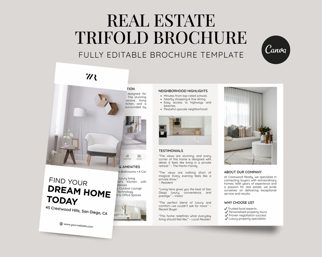
How to Evaluate a Template Before Using It
When comparing a free template tri fold brochure for business with a paid design, evaluate the structure before evaluating decoration. Look at the number of usable panels, the amount of room available for photography, the readability of the text areas, and the way contact information is positioned. A simpler template can be more useful than a visually elaborate one if it matches the campaign requirements.
For broader searches such as free brochure trifold template for marketing, remember that a generic marketing brochure may require substantial adaptation before it works for property promotion. Real estate has distinctive content needs: property photographs, addresses, features, floor plans, neighborhood information, agent details, and viewing instructions often need to coexist in the same document.
The phrase free template tri fold brochure design can also lead to layouts created for industries unrelated to property marketing. Those examples can still provide useful ideas about grid systems, typography, color, and panel sequencing, but the final design should be judged by how naturally it accommodates real estate information rather than by how attractive the preview appears in isolation.

When reviewing a home marketing tri fold brochure template free download search result, verify the actual file type and the rights associated with its contents before using it in a commercial campaign. A preview image does not automatically tell you whether the underlying file is editable, whether included photographs can be reused, or whether fonts and graphic elements have restrictions.
The same principle applies to home marketing tri fold brochure template free searches. “Free” can describe a variety of conditions, so read the provider’s current terms carefully. The useful question is whether the design can be used for the intended project under terms that you understand and accept.
For a business-focused campaign, a free template tri fold brochure for business can be a starting point when the layout already supports branding, services, contact information, and multiple property visuals. The best result comes from customizing the structure thoughtfully rather than simply replacing placeholder text and images.
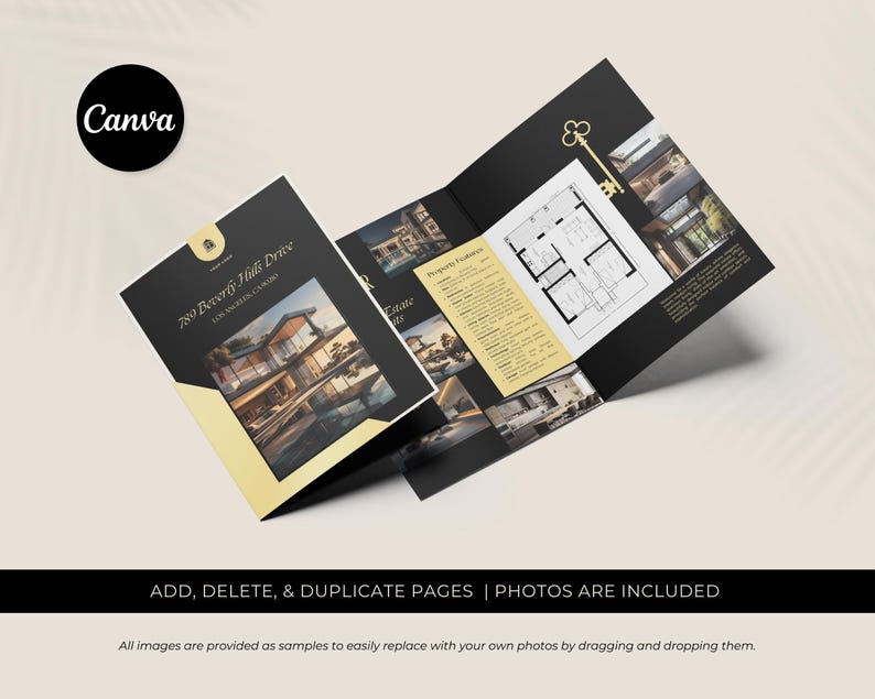
Practical Solution
Start by defining the brochure’s single most important objective. If the goal is to promote one home, collect the verified property facts, choose the strongest exterior and interior photographs, and write a concise value proposition. If the goal is to promote an agency, list the services that matter most to the target audience and select property images that support the brand. If the goal is an open house, make event information highly visible and design the contact panel around the next action.
Next, map those materials onto six panel roles before changing the visual styling. Reserve one panel for the cover, two or three for the property story, one for supporting location or agency information, and one for contact details. Adjust that sequence when the campaign requires a different hierarchy. The important point is to assign every panel a job so that the finished brochure does not become a collection of disconnected elements.
Then edit the layout systematically. Replace placeholder photographs first, because image proportions often affect the surrounding composition. Adjust headings and body copy next, then refine spacing, colors, icons, and branding. Keep important facts concise, maintain consistent alignment, and remove decorative elements that do not improve understanding. Once the content is complete, inspect the brochure at actual print size and verify every factual detail before production.

A practical quality-control checklist can be divided into four groups. Content: confirm address, property details, price, dates, services, contact information, and calls to action. Design: check hierarchy, alignment, spacing, contrast, image cropping, and fold safety. Production: confirm page size, resolution, margins, and final export settings. Compliance: confirm that photographs, fonts, logos, testimonials, and other creative assets can be used for the intended purpose.
After the first brochure is produced, save the underlying structure as a repeatable brand system. Keep a consistent logo position, color palette, heading hierarchy, contact block, and image treatment. Then future property brochures can be created by replacing the listing-specific content while preserving the established visual identity. This approach improves consistency without forcing every property into exactly the same creative presentation.
The most useful outcome is not simply a visually attractive tri-fold. It is a brochure that answers the reader’s immediate questions, communicates the property’s strongest verified advantages, creates confidence in the marketer, and provides an obvious path to further information. That is the standard against which any tri fold brochure template should ultimately be judged.
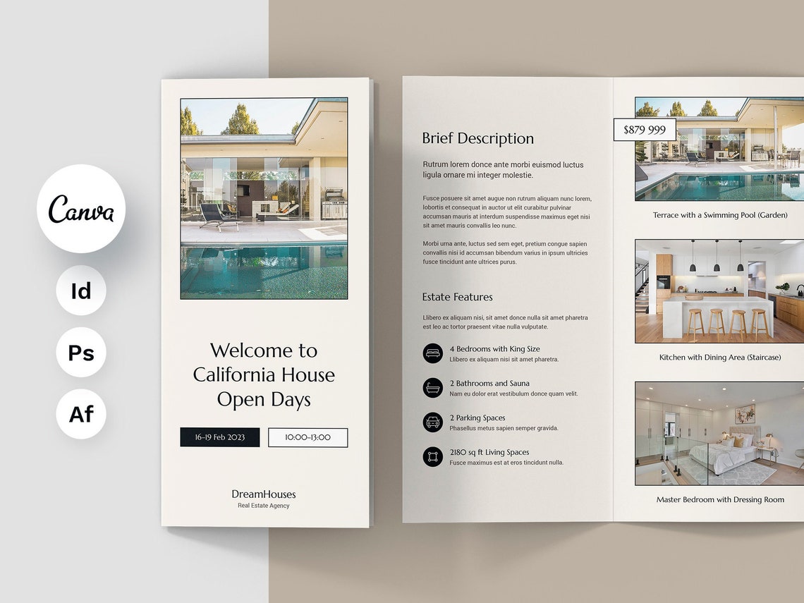
Reference Examples
A home marketing tri fold brochure Template can take many visual forms while retaining the same underlying purpose: organize property information into a compact, persuasive sequence that readers can scan and understand. Useful examples typically combine a strong cover image with structured interior panels, concise feature descriptions, property photography, location or neighborhood information, and a clearly identifiable contact area. When evaluating an example, look beyond colors and decoration. Pay attention to panel hierarchy, image placement, text density, fold-safe spacing, and the relationship between the property story and the brand identity. Those details reveal whether a layout is genuinely practical for residential property marketing.
The following visual references illustrate different approaches to the home marketing tri fold brochure Template , including modern agency presentations, single-property showcases, open-house layouts, luxury property designs, and structured listing brochures. They can help readers compare how photographs, headings, feature lists, floor plans, QR codes, contact information, and supporting copy are arranged across a folded document. The examples are most useful when treated as design references rather than finished formulas. A strong brochure should borrow principles such as hierarchy, balance, clarity, and consistency while adapting the actual content to the property and audience being addressed.

California House Open Days Brochure
Source: Etsy

Open-House Folded Brochure Presentation
Source: Etsy
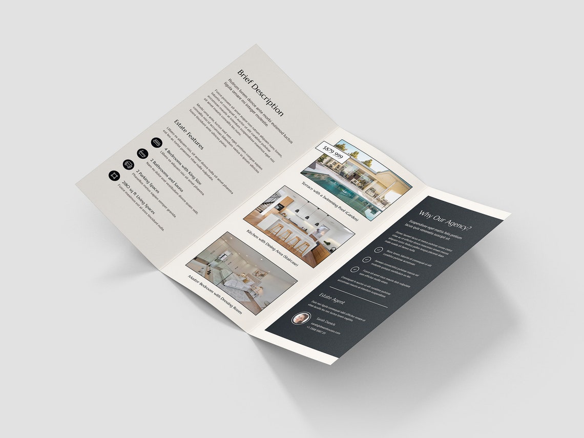
Real Estate Open House Brochure Template
Source: Etsy

California House Open Days Cover
Source: Etsy
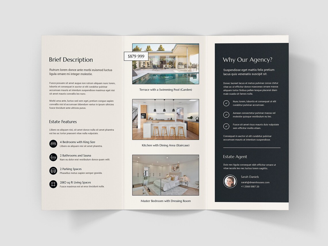
Real Estate Open House Interior Spread
Source: Etsy
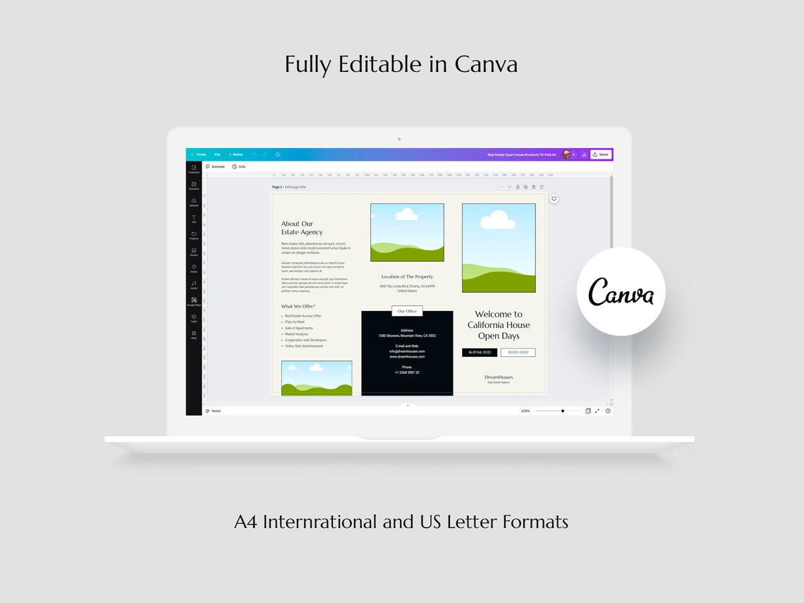
Real Estate Brochure Editing Layout
Source: Etsy
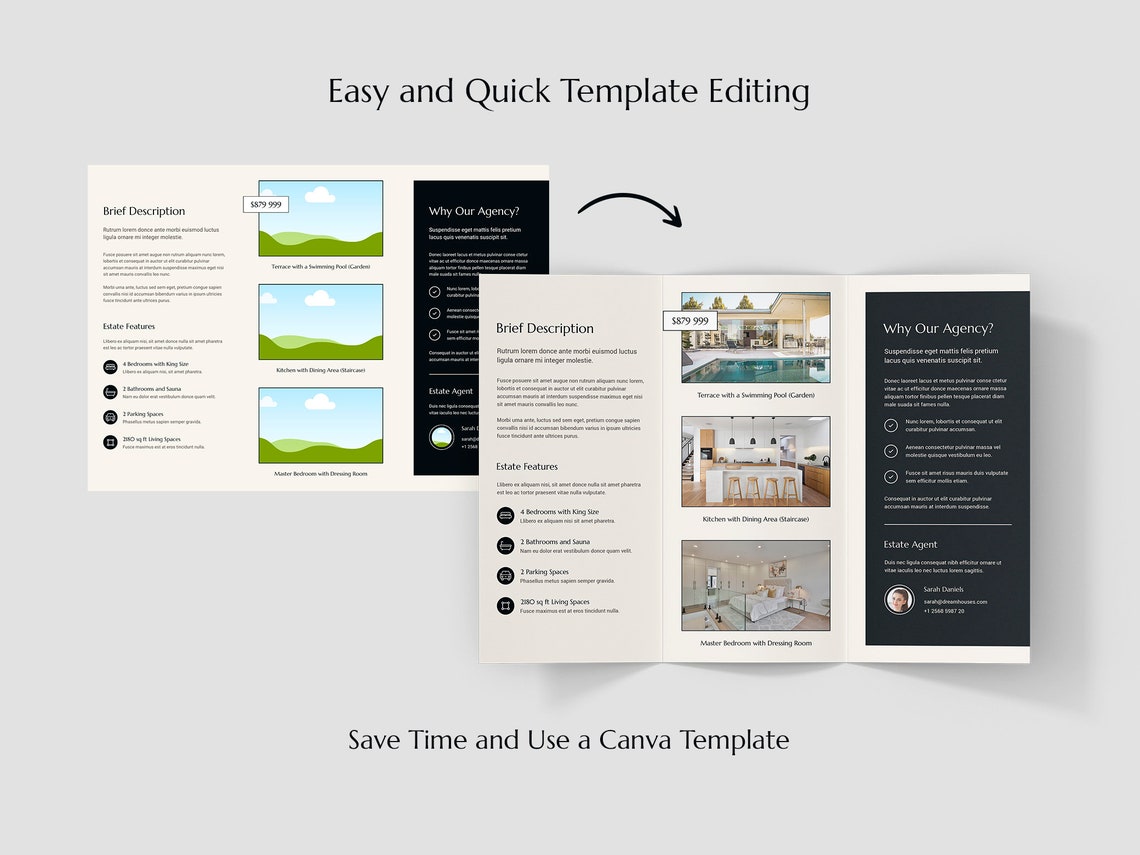
Real Estate Brochure Editing Example
Source: Etsy
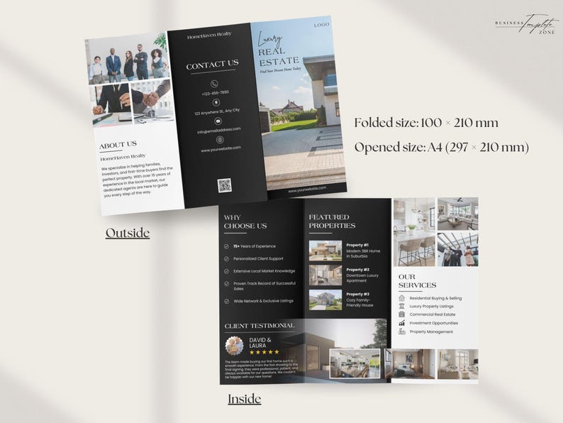
Real Estate Trifold Brochure Template
Source: Etsy
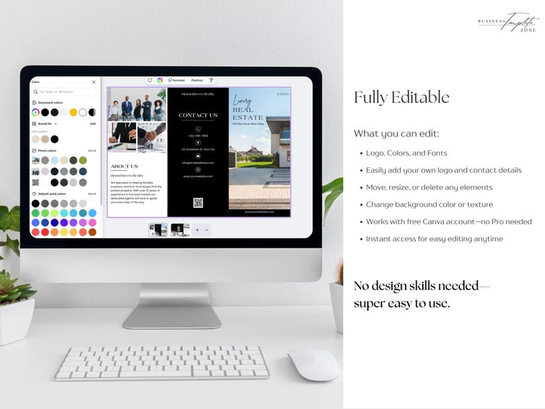
Editable Real Estate Brochure Layout
Source: Etsy
