A yoga and meditation business card Template is more than a small piece of contact information. For a yoga teacher, meditation guide, wellness coach, retreat organizer, or studio owner, it can become a compact expression of the brand’s atmosphere, teaching style, and client experience. A strong card should communicate what you offer within a few seconds while remaining calm, readable, memorable, and practical enough to keep in a wallet or place beside a desk.
The most effective designs usually balance visual serenity with useful business information. Lotus symbols, restrained botanical motifs, mandalas, soft gradients, natural colors, generous spacing, and carefully selected typography are common approaches. However, a professional design does not need every traditional wellness symbol at once. The better strategy is to select a visual language that reflects the particular practice and then build the contact information around it.
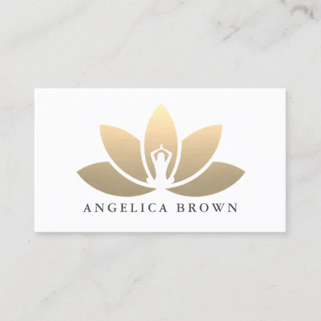
Current template examples show a broad range of approaches, from minimalist cards with a single lotus mark to richer designs using mandalas, Om-inspired symbolism, watercolor textures, QR codes, and contrasting front-and-back layouts. This variety is useful because it demonstrates that there is no single correct aesthetic. The right choice depends on whether the card represents an individual instructor, a meditation service, a studio, a retreat business, or a broader wellness brand.
What makes a yoga and meditation business card effective?
The strongest card designs establish hierarchy before decoration. The business or instructor name should be easy to locate, followed by a concise description such as yoga instructor, meditation teacher, yoga studio, mindfulness coach, or wellness practitioner. Contact details should remain readable at the physical size of the finished card. A beautiful card that makes a phone number, email address, or website difficult to find is less useful than a simpler design with excellent information hierarchy.
A second consideration is brand consistency. If the studio already uses particular colors, typography, illustrations, or a logo, the business card should extend that identity instead of introducing an unrelated visual style. A teacher whose website uses muted sage and warm cream, for example, can carry those colors onto the card and use a restrained lotus outline as the connecting element. Consistency helps the card feel like part of a real business rather than an isolated piece of stationery.
The physical design also matters. A horizontal card generally provides familiar space for a name, title, phone number, email, website, and social handles. A vertical format can create a more editorial or boutique appearance and works particularly well with botanical illustrations or tall lotus motifs. Rounded corners, textured stock, metallic-looking artwork, and colored backgrounds can add character, but they should support the message rather than compete with it.

Essential information to place on the card
Start with the information a prospective client actually needs to take the next step. For an individual teacher, that normally means the instructor’s name, professional role, phone or email, website or booking destination, and optionally one social channel. For a studio, the business name, location, website, class focus, and a direct contact method may be more important. Avoid filling the card with a complete service menu when a short description can direct people elsewhere.
A useful front side can be deliberately simple: logo or symbol, business name, and a short positioning line. The reverse side can contain contact details and a short call to action. For example, an instructor could use “Private yoga, small groups, and guided meditation” followed by an email address and website. A studio might instead emphasize “Yoga classes, meditation sessions, and weekend retreats.” These are examples rather than mandatory wording; the best line should accurately describe the actual services offered.
QR codes can be useful when they lead to a stable, mobile-friendly destination such as a booking page, schedule, website, or contact page. They should not replace the basic printed information. A card may be viewed in a place where scanning is inconvenient, and some people simply prefer to type an email address or website. Keep enough contrast around a QR code and leave sufficient visual space so the code remains easy to scan after printing.

Choosing colors for yoga and meditation branding
Color is one of the quickest ways to establish the emotional character of a wellness brand. Sage, eucalyptus, muted teal, cream, sand, dusty rose, lavender, warm gray, and deep navy can create different interpretations of calm. Green often works well for nature-oriented studios, while blue and teal can create a cooler, cleaner feeling. Warm neutrals can feel grounded and understated, and dark backgrounds with metallic-looking typography can produce a more premium visual direction.
The important point is not to treat any color as inherently spiritual or relaxing. Color should be evaluated in relation to contrast, readability, printing, and the existing brand. A pale beige text treatment may look elegant on a screen but become difficult to read when printed. Similarly, a complex watercolor background can make small contact information disappear. Use contrast deliberately and test the card at actual size rather than judging only from a large monitor preview.
Color combinations can also distinguish different services under one brand. A studio offering yoga and meditation might use sage green as its primary brand color, then reserve lavender for meditation workshops or warm terracotta for retreats. This creates a coherent family of materials without making every card identical. If the business has only one card, choose the palette that best represents the central service rather than trying to represent every possible offering.

Typography and visual hierarchy
Typography should reinforce the calm character of the brand while preserving legibility. A refined serif can make a meditation or retreat business feel established, while a clean sans serif can create a contemporary studio identity. Script lettering can add warmth to a personal instructor brand, but it is usually better reserved for a name or short accent rather than long contact information.
Use contrast in size and weight to establish a clear reading order. The viewer should notice the business name first, the service or role second, and the contact details third. Avoid using several decorative typefaces in the same card. One expressive font paired with one highly readable supporting font is often enough. Spacing also matters: cramped lines can make a peaceful design feel unexpectedly busy.
Symbols should receive similar discipline. A lotus, mandala, Om symbol, leaf, sun, moon, or abstract circle can act as a visual anchor, but using multiple symbolic systems together may make the card feel generic. Choose one primary symbol and let the typography, color, and spacing support it. The goal is recognition, not visual accumulation.

Popular layout directions
Minimalist layouts
Minimalist cards use a limited number of elements and generous negative space. This approach is particularly effective for instructors who want their personal name to function as the main brand. A small lotus outline at the top, a name in the center, and a short title underneath can be enough on the front. The reverse side can contain contact information without additional decoration.
The benefit of minimalism is adaptability. A clean card can work for yoga, meditation, breathwork, coaching, retreats, or other related services without needing a complete redesign. It also tends to remain readable as the card ages and as branding changes. If the business expands its service range, the design can accommodate new wording more easily than a highly specialized illustration.
Minimalism does not mean the card has to look plain. Texture, paper choice, a carefully drawn symbol, subtle contrast, or a distinctive typeface can provide personality without overcrowding the composition. The visual restraint itself can become part of the brand message.

Lotus and botanical layouts
Lotus-based designs are common because the flower can communicate themes of growth, balance, calm, and renewal without requiring a large amount of text. A simple outline can feel contemporary, while a detailed botanical illustration can create a more traditional or artistic impression. The surrounding typography should be selected according to the level of detail in the illustration.
Botanical layouts are especially useful for studios that want to connect yoga with nature, wellness, retreats, or holistic services. Leaves, petals, branches, and soft organic shapes can provide a recognizable visual system across cards, appointment materials, signage, and other printed pieces. The same motif can be simplified for small sizes so that it remains recognizable rather than becoming a dense block of detail.
When using a floral motif, consider how it interacts with the information area. A large illustration may work well on the front, while the reverse should remain substantially clearer. This creates a useful contrast between brand expression and practical information.

Mandala and geometric layouts
Mandala designs can create a highly recognizable wellness aesthetic, especially when a business already uses geometric patterns elsewhere. Their symmetry can provide a natural focal point around a logo or name. A detailed mandala, however, should not sit behind small text unless sufficient contrast is preserved.
Geometric designs can also be modernized through partial patterns. Instead of placing a complete mandala in the center, a cropped pattern can occupy one edge or corner while the remaining space stays open for contact information. This approach often produces a more contemporary card while retaining the visual association with meditation and mindful practice.
For a premium-looking design, restrained metallic colors such as muted gold or bronze can be paired with charcoal, navy, cream, or forest green. These are design examples, not requirements. The final palette should reflect the business’s actual identity and printing capabilities.

Choosing a template format
Different editing formats serve different workflows. Someone who regularly works with Microsoft Word may prefer a yoga and meditation business card template word format because text editing is familiar and straightforward. A yoga and meditation business card template word free search may appeal to people who want a basic starting point, but always check the actual licensing and usage terms of the resource before relying on it for commercial branding.
For document-based editing, a yoga and meditation business card template google docs workflow can be convenient when several collaborators need to review wording or contact details. A PDF-oriented workflow can be useful when the layout needs to remain visually fixed, while a yoga and meditation business card template pdf may also be useful as a print reference. The key distinction is whether the format is intended for editing or for final visual output.
Design professionals often prefer layered source files. A yoga and meditation business card template psd can be useful when Photoshop-based editing is part of the workflow because separate layers may make it easier to change colors, typography, logos, or decorative elements. A yoga and meditation business card template canva workflow can be attractive to people who want browser-based editing and quick customization. The best format is therefore the one that matches the tools, skills, and production process already being used.

How to customize the card without losing its professional look
Begin by replacing placeholder information before making decorative changes. Insert the real business name, instructor name, title, website, email address, phone number, location, and social handle if needed. This helps reveal whether the original template actually has enough space. A layout that looks balanced with short sample text may become crowded when the real business name is longer.
Next, reduce information rather than shrinking the type. If the card becomes crowded, remove secondary details before making the contact text tiny. For example, a full street address may be unnecessary when clients are directed to a website with location information. Likewise, several social handles can often be replaced by one website or QR code that leads to a social profile hub.
Finally, inspect the design at its intended physical dimensions. Check edges, spacing, small text, QR-code placement, and the relationship between the front and back. If the card will be printed professionally, confirm the printer’s requirements for dimensions, bleed, safe areas, color mode, and file format rather than assuming every template uses the same specifications.

Using the front and back strategically
The front should usually answer the recognition question: who is this and what does the business represent? The back should answer the action question: how can someone contact or book this business? This division prevents the card from becoming a miniature brochure. The front can therefore carry the strongest brand image while the reverse handles the practical details.
For an individual teacher, the front might contain a logo, name, and “Yoga Instructor & Meditation Guide.” The reverse could include email, website, phone, location, and a QR code. For a studio, the front might emphasize the studio name and a distinctive symbol, while the reverse could mention class categories, location, and booking information.
A two-sided design also allows a business to create a memorable secondary purpose. The reverse might include a short breathing reminder, a simple posture cue, a studio value statement, or a compact invitation to visit the website. Keep such content short and ensure it does not interfere with the essential contact information.

When a business card should connect to other printed materials
A card can become more useful when it belongs to a wider set of branded materials. A studio might use matching colors and typography on class schedules, retreat materials, referral cards, signage, and social graphics. An instructor could carry the same logo and visual language into workshop handouts and client resources.
This is also where related resources can support the marketing system. A yoga teacher creating educational material might use free printable yoga cards as a conceptual reference for simple instructional formats, while someone developing workplace wellness resources might research yoga at your desk cards for ideas about compact exercise prompts. These are separate content formats from a business card, but their visual treatment can inform how information is organized into small, easy-to-use pieces.
Meditation educators may similarly encounter meditation cards free printable resources when developing short mindfulness prompts. The important distinction is that a business card is primarily an identity and contact tool, whereas an instructional card is primarily an educational tool. Combining the purposes carelessly can make a business card too crowded, so use related card formats for inspiration rather than trying to place all of their content onto one contact card.

Using a business card as part of a yoga studio business plan
A card should support a broader business strategy rather than function as the entire marketing strategy. When developing a business plan template for yoga studio work, consider the card as one small component of the customer journey. The plan may identify target clients, services, pricing, location, promotion channels, retention methods, and operating costs, while the card provides a physical introduction to the brand.
For example, a new studio may meet prospective clients at community wellness events, workshops, retreats, or local partnerships. A consistent business card can give those contacts a clear next step after the conversation. If the studio’s website contains the current timetable and booking information, the card can point people there rather than becoming outdated every time a class schedule changes.
This makes information durability important. Avoid printing details that are likely to change frequently unless they are central to the brand. A studio name, instructor identity, website, and broad service description can remain useful for a longer period than a specific class time. When details do change, the card can continue directing people to the online destination where the current information is maintained.

Common mistakes to avoid
The first common mistake is overcrowding. Wellness businesses sometimes try to list every service, certification, class style, social profile, address, phone number, slogan, and decorative symbol on one small surface. The result may technically contain everything but communicate nothing clearly. Choose the information that helps a new contact recognize the business and take the next useful action.
The second mistake is confusing decoration with brand identity. A lotus or mandala can be attractive, but thousands of wellness brands use similar symbols. Distinctiveness may come from typography, color, composition, a unique logo, an original illustration, or a memorable phrase that genuinely belongs to the business. Use familiar wellness imagery selectively and let the complete combination create the identity.
The third mistake is ignoring production quality. Thin text, weak contrast, tiny QR codes, crowded edges, and overly detailed artwork can create problems when a design moves from screen to print. Always inspect the final layout at physical size and, where possible, review a physical proof before committing to a large print run.

Practical Solution
Start by defining one sentence that explains the business clearly. This sentence does not necessarily need to appear word for word on the card, but it should guide the design. For example, a hypothetical instructor might define the brand as “private yoga and guided meditation for busy professionals.” That positioning immediately suggests a calmer, contemporary design rather than a highly ornate spiritual aesthetic.
Next, choose one visual direction and one primary layout. Select a color family, a logo or symbol, a heading typeface, and a supporting typeface. Then build the front around recognition and the reverse around action. Use the smallest amount of information that allows a new contact to understand the service and reach the business without confusion.
Before final production, run a practical checklist. Confirm that every name is spelled correctly, contact information works, the website is current, the QR destination is correct, the text remains readable, and the design is consistent on both sides. Print a single physical proof and examine it under ordinary lighting. If the card still looks calm, clear, and professional at its real size, the template is doing its job.
A useful final test is to hand the proof to someone who has never seen the brand and ask what they think the business offers after looking at the card for a few seconds. If the answer is unclear, simplify the hierarchy. If they understand the service but cannot identify how to contact the business, strengthen the information area. If they understand both but cannot remember the visual identity, refine the logo, color, or distinctive design element.

Comparing design styles before choosing a template
A calm neutral card is often appropriate for a teacher who wants the personal relationship to lead the brand. A vivid watercolor card may suit a creative yoga instructor or retreat business. A dark navy or charcoal design can suggest a more premium meditation practice. A botanical cream design can work well for a studio emphasizing nature and holistic wellness. None of these approaches is automatically superior; the decision should follow the actual positioning of the business.
It is also useful to compare horizontal and vertical formats. Horizontal cards generally provide more predictable space for contact information and are familiar to most recipients. Vertical cards can make a stronger visual statement and work particularly well with tall botanical artwork, stacked typography, or narrow logos. Square cards can be distinctive, but they should be chosen only when the unusual shape supports the brand rather than simply making the card different.
Template comparison should therefore focus on more than appearance. Ask whether the editable areas accommodate the real information, whether the visual style matches the website and physical studio, whether the typography remains readable, and whether the artwork can be adapted without losing quality. A visually attractive template that cannot accommodate the real business name is not a practical choice.

Examples for individual instructors and studios
An individual instructor may benefit from making the person’s name the strongest visual element. This is particularly appropriate when clients are choosing a teacher based on personality, teaching philosophy, or specialist expertise. The title can sit directly below the name, while a website or QR code provides the route to schedules, testimonials, or booking information.
A studio has a different priority because the business name may matter more than an individual instructor. The front can therefore feature the studio logo and a concise service category, while the reverse provides location and contact details. If several instructors work there, avoid building the card around one person unless that person is the studio’s primary brand identity.
Retreat organizers and meditation guides can use a more editorial approach. A quiet background, one symbolic image, and a short description can make the card feel connected to a retreat environment. The reverse can then provide the website and contact route without attempting to explain the entire retreat experience.

How to prepare the final file for production
Once the content and design are settled, check the production specifications of the intended printer. Card dimensions, bleed, safe areas, color requirements, image resolution, and acceptable file types vary between providers. Do not assume that a template created for one production method will automatically meet another provider’s requirements.
Keep important text away from the cutting edge and avoid placing delicate details where trimming variations could affect readability. If the card has a background pattern, decide whether that pattern should extend beyond the final trim. A deliberate bleed is generally preferable to having a thin unprinted line appear along an edge, but the exact production setup should follow the printer’s instructions.
Finally, preserve an editable master version separately from the final print file. This makes future revisions easier when a phone number, website, instructor, or studio location changes. A well-organized source file also allows the same visual identity to be adapted into other marketing materials without rebuilding the design from scratch.
Reference Examples
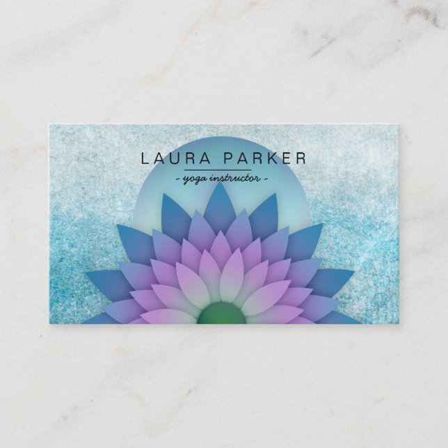
Reference examples are useful when evaluating a yoga and meditation business card Template because they reveal how the same broad subject can be interpreted through very different visual systems. Some cards rely on a single lotus icon and restrained typography, while others use mandalas, watercolor textures, symbolic circles, bold color blocks, or detailed botanical artwork. Looking at several approaches side by side makes it easier to identify what actually feels appropriate for a particular instructor or studio. Pay attention not only to the artwork, but also to the balance between the brand name, service description, contact details, background, and negative space.
The following visual references can help when comparing possible directions for a yoga and meditation business card Template. Use them to study composition, color relationships, symbol placement, typography hierarchy, and the amount of information that can comfortably fit on a small printed surface. They are best treated as design references rather than instructions to reproduce another creator’s work. A strong final card should translate useful structural ideas into an original identity that accurately represents the actual business, its services, and the experience it wants clients to associate with the brand.

Turquoise Teal Watercolor Lotus Mandala Yoga Square Business Card
Source: Zazzle

Yoga & Meditation Teacher Vintage Lotus Mandala Business Card
Source: Zazzle

Om Symbol Lotus Mandala Yoga & Meditation Business Card
Source: Zazzle
