A filmmaker business card Template is a practical starting point for presenting a director, producer, cinematographer, editor, videographer, or production company in a compact professional format. The strongest designs do more than decorate contact information with a clapperboard or film reel. They establish a clear visual identity, communicate a specific filmmaking role, and make it easy for another person to remember how to reach you.
Search interest around filmmaker card layouts usually reflects a practical need: people want a design that looks cinematic without becoming difficult to read. A good layout therefore balances personality with hierarchy. Your name, professional role, company identity, email address, website, telephone number, and portfolio destination should remain easy to locate even when the card is viewed quickly at a networking event.
Current examples from design marketplaces show several recurring approaches, including clapperboard motifs, film-strip borders, camera illustrations, reel graphics, monochrome compositions, restrained luxury styling, and colorful contemporary layouts. These examples also demonstrate that a filmmaking card does not need to look identical to a movie poster. In many cases, a simpler identity creates a more professional impression because the contact information remains the visual priority.

What a filmmaker business card Template should accomplish
The primary purpose of a filmmaker business card is identification. Someone who receives the card should be able to understand who you are, what part of filmmaking you specialize in, and how to continue the conversation. A director might emphasize directing and production, while a cinematographer could make the camera and visual-production role more prominent. An editor may prefer a restrained design that directs attention toward a portfolio or reel.
The second purpose is brand recognition. A card can reinforce the same visual language used on a production website, reel, title sequence, proposal, or studio identity. Consistent typography, colors, logo treatment, and wording make your professional identity easier to recognize across different materials. This is especially useful for independent filmmakers who may work across several projects rather than under one large studio identity.
The third purpose is action. The recipient should know what to do next. That might mean visiting a portfolio, contacting you about production work, requesting a proposal, discussing a collaboration, or reviewing a showreel. A concise website address or carefully tested QR code can support that next step, but it should not overwhelm the basic contact information.
Choose the layout according to your filmmaking role
A director-oriented card often benefits from strong typography and one recognizable cinematic symbol. A clapperboard, camera, or film-strip detail can immediately establish context, while the name and title provide the actual professional identification. The visual does not need to dominate the entire card. In many successful layouts, it occupies one controlled area while the remaining space is reserved for readable information.
A cinematographer has slightly different communication needs. Because cinematography is strongly associated with visual craft, a camera image or lens-inspired graphic can work particularly well. However, a detailed photographic camera can compete with the typography if it is too large. The most effective approach is usually to select one visual anchor and allow generous negative space around the professional details.
Editors, colorists, sound professionals, producers, and production managers can use the same principle without relying on a literal camera illustration. A film reel, timeline-inspired geometry, subtle frame marks, or carefully chosen typography can communicate the connection to production without making the card look like merchandise. The role should remain clear even when the decorative element is removed.
Essential information to place on the card
Start with your full professional name. If you operate under a studio or production brand, decide whether the personal name or company name should receive greater visual emphasis. For an individual filmmaker, the personal name is usually the most important recognition element. For a production company, the company identity may lead while the individual contact person appears beneath it.
Your professional role should be specific enough to explain your specialty without becoming a long service list. “Film Director,” “Cinematographer,” “Film Editor,” “Producer,” and “Video Production” are clearer than a crowded collection of every skill you have ever used. If your work spans several disciplines, select the role that is most relevant to the people you expect to meet.
Contact information should be limited to channels that you actually monitor. A professional email address, telephone number, website, and portfolio destination are usually more useful than filling the card with multiple social profiles. If social media is important to your work, include only the platforms that genuinely support your professional identity.
- Name: Make the primary identity immediately visible.
- Role: State the filmmaking specialty clearly.
- Email: Use a professional address that is checked regularly.
- Telephone: Include it when direct communication is important.
- Website: Point contacts toward your portfolio or studio presence.
- QR code: Use one only when it leads to a useful, mobile-friendly destination.
- Company: Include the production or studio identity when it strengthens recognition.
How typography affects a filmmaking card
Typography can communicate more about a filmmaker than a collection of decorative symbols. A geometric sans serif may create a contemporary production identity, while a restrained serif can suggest a more editorial or cinematic character. Script lettering can add personality, but it should generally be limited to a short brand element because long contact details become difficult to scan.
Hierarchy matters more than choosing a fashionable typeface. The recipient should visually encounter the name first, the professional role second, and supporting contact information afterward. This can be achieved through size, weight, spacing, alignment, and contrast rather than excessive font changes.
Before approving a design, inspect it at its actual physical size. A typeface that appears elegant on a large monitor may become cramped or unclear when printed at business-card dimensions. Small text, thin strokes, tightly spaced characters, and low-contrast combinations deserve particular attention because they can become noticeably harder to read after printing.
Using cinematic graphics without overcrowding the design
Film-related symbols are useful because they establish context quickly. A clapperboard can communicate directing or production, a reel can suggest traditional cinema, and a camera can reinforce cinematography or videography. These symbols work best when they support the identity rather than replacing it.
One strong graphic is often more effective than several smaller ones. Combining a camera, reel, clapperboard, film strip, lens, theater mask, and multiple decorative frames can create visual competition. The card then starts to resemble a poster rather than a professional contact piece. Select one dominant motif and let typography and spacing complete the composition.
Color should also serve the identity. Black and white can create a restrained cinematic appearance, while gold accents can suggest a premium studio identity. Strong color blocks can make a modern production brand more recognizable. Whatever palette you choose, test text contrast carefully and make sure the information remains readable under ordinary lighting.
Horizontal versus vertical card layouts
Horizontal business cards remain a familiar choice because they provide a wide area for a name, role, contact details, and a supporting graphic. This format works particularly well when the design includes a film strip running across the card or a camera image positioned beside the contact information.
Vertical layouts can create a more editorial or poster-like appearance. They can be especially effective when a film-strip border runs from top to bottom or when a logo needs a tall composition. The drawback is that some recipients may store vertical cards differently or find them less familiar during quick exchanges.
The right orientation depends on the identity rather than a universal rule. A filmmaker whose visual brand relies on a wide cinematic frame may prefer horizontal. A creative studio using tall typography or a strong vertical logo may benefit from a portrait orientation. In either case, preserve enough space around the important details to prevent a crowded appearance.
Standard dimensions, bleed, and safe areas
A commonly used United States business-card dimension is 3.5 by 2 inches. Adobe Express also identifies 3.5 by 2 inches as a standard horizontal format and notes that important text and logos should remain toward the center so they are protected during trimming. :contentReference[oaicite:0]{index=0}
When artwork extends to the edge, the printer may require additional bleed beyond the finished trim size. One current size reference describes a 0.125-inch bleed on each side for a 3.5 by 2-inch card, resulting in a working canvas of 3.75 by 2.25 inches. Printer specifications should take precedence because trimming and safe-area requirements vary by production service. :contentReference[oaicite:1]{index=1}
Do not place names, email addresses, QR codes, or logos directly against the trim boundary. A safe area gives important content visual breathing room and protects it from small cutting variations. This is especially important for filmmaker cards containing film-strip borders or full-bleed photographic backgrounds, because edge-to-edge artwork leaves less visual tolerance for trimming.
Choosing an editable file format
Different editing formats serve different workflows. A layered design format is useful when you need to change typography, colors, logos, or individual graphics independently. A word-processing format may be more convenient for simple text-oriented layouts, while a PDF is useful for preserving a finished composition for review or print production.
For a filmmaker who frequently changes projects or works under different production identities, an editable master is particularly useful. Keep a clean version with organized layers, consistent naming, and replaceable contact information. This makes future revisions much easier than rebuilding the card from a flattened image.
When moving between formats, inspect the final result rather than assuming that fonts, spacing, transparency, and graphic placement will remain identical. A layout that looks correct in one design environment can shift when opened elsewhere. Maintaining a print-ready master and a separate working version helps preserve consistency.
Designing for print and digital sharing
A physical card and a digital contact image have different practical requirements. Printed cards need consideration for trim, paper stock, ink coverage, contrast, and physical legibility. A digital version may be viewed on a phone, inside an email, or through a messaging service where the design is displayed much smaller than the original canvas.
Create the design so the core identity survives both situations. The name, role, company identity, and primary contact route should remain recognizable even when the card is scaled down. Avoid depending on tiny decorative text or subtle background details to communicate important information.
Digital sharing also makes QR codes and short website addresses more useful. If a QR code is included, test it from multiple distances and devices before production. It should point to a relevant portfolio or professional destination rather than a page that requires unnecessary steps before the recipient can understand your work.
QR codes and portfolio links
A filmmaker’s portfolio is often more persuasive than a long list of services. A business card should therefore make the transition from physical networking to visual work as simple as possible. A short website address, portfolio destination, or carefully tested QR code can bridge that gap.
The destination should be mobile-friendly and immediately relevant. If the card identifies you as a cinematographer, the linked page should make cinematography work easy to find. If you are a director or producer, the destination might prioritize selected projects, a reel, production credits, or studio information.
Avoid placing several QR codes on one card unless there is a compelling reason. Multiple codes introduce uncertainty about which one matters. One carefully selected destination usually provides a cleaner experience and leaves more room for the professional identity.
How to make a filmmaker card look distinctive
Distinctiveness does not require visual complexity. A recognizable logo, unusual but readable typography, a restrained color combination, or a memorable film-related motif can establish individuality without overwhelming the card. The best design choice is usually one that can also appear elsewhere in the filmmaker’s professional identity.
Consider what you want someone to remember after the meeting. If the key message is “cinematographer,” the card should reinforce that specialization. If the key message is “independent production studio,” the company name and visual identity should receive greater emphasis. Design decisions should follow this communication goal rather than decorative trends.
Professional consistency is also a form of distinction. If your card uses one visual language while your website and reel use another, the recipient may not immediately connect the materials. Matching typography, colors, logo treatment, and terminology across your professional touchpoints can make a small card feel much more established.

Color strategies for cinematic branding
Black is naturally associated with cinema because it provides a strong background for white typography, metallic accents, and film-related graphics. A black card can feel sophisticated, but it requires careful attention to contrast and printing. Thin dark-gray text on black can become difficult to read.
Gold can provide a premium visual accent when used sparingly. A gold border, emblem, or small typographic detail can create a polished studio identity without turning the entire design into a decorative composition. White space remains important even when the palette is dark or luxurious.
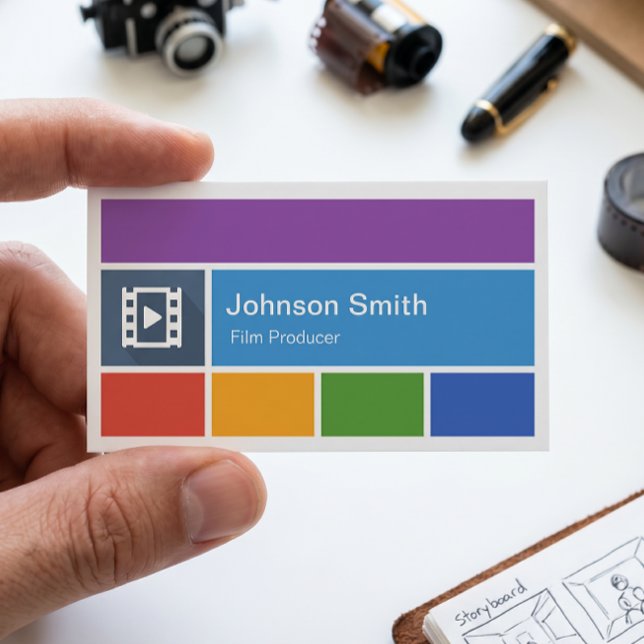
Brighter colors can work well for modern filmmakers, video creators, and production studios that want a contemporary identity. Blue, purple, turquoise, or warm accent colors can distinguish a card from conventional black-and-white designs. The strongest palette is one that also makes sense on the filmmaker’s website and portfolio.

Practical Solution
Start by writing the exact professional identity you want the card to communicate in one short line. For example, a hypothetical independent filmmaker might use “Alex Morgan — Director & Producer.” A cinematographer might instead use “Jordan Lee — Cinematographer.” This simple decision prevents the layout from becoming a collection of unrelated services and gives the visual hierarchy a clear starting point.
Next, choose one visual direction and one primary layout. For a cinematic identity, that might mean a clapperboard, camera, film reel, film strip, or minimal geometric treatment. Place the name and role where they can be identified immediately, then add only the contact channels that matter. Build around the standard card dimensions and protect important content with a safe margin. If the artwork reaches the edge, confirm the printer’s bleed specification before preparing the final file.
Finally, inspect the card in three situations: full-size on screen, at actual physical size, and as a small digital image. Check spelling, telephone numbers, website addresses, QR behavior, alignment, contrast, and the readability of every important line. Print one physical proof when possible before ordering a larger quantity. A professional filmmaker business card Template succeeds when the design still communicates your role clearly after the cinematic decoration is stripped away.

Common mistakes to avoid
One common mistake is trying to place every professional capability on the card. Filmmakers often work across directing, shooting, editing, producing, photography, and content creation, but listing everything can make the identity unclear. Select the role most relevant to your current business objective and let your portfolio demonstrate the wider range of work.
Another mistake is choosing decorative typography that reduces readability. A cinematic script or distressed display font may look appropriate in a title sequence but can become problematic for phone numbers and email addresses. Use expressive typography for the brand element and highly readable typography for information that someone needs to act on.
A third mistake is relying on a visually impressive preview without checking the actual printed scale. Mockups can make a card look luxurious because of lighting, shadows, texture, and photography. The real test is the flat printed card in ordinary conditions. Review the physical hierarchy, contrast, trim, and legibility before considering the design finished.

When a minimalist design is the better choice
Minimalism can be particularly effective when the filmmaker already has a strong portfolio or recognizable personal identity. The card does not need to explain every aspect of the profession because the website or reel can provide the deeper story. A simple logo, name, role, and contact path may therefore be more memorable than a heavily illustrated design.
Minimal layouts are also easier to maintain. When a phone number, website, company name, or role changes, fewer design elements need adjustment. They tend to adapt well across printed cards, digital contact images, proposals, email signatures, and other brand materials.
Minimalism does not mean generic. Strong spacing, precise alignment, a distinctive typeface, a carefully designed logo, or an unusual color combination can create a sophisticated identity without filling the canvas. The goal is controlled simplicity rather than visual emptiness.

Using photography and production imagery
Photography can make a filmmaker card highly distinctive, especially when the image is connected to the person’s visual style. A cinematographer might use a carefully selected frame, while a production studio could use a restrained still from a recognizable project. The image should support the identity rather than simply occupy empty space.
When using a photograph, maintain enough contrast for the text. A busy image behind contact information can force the designer to add overlays or panels, increasing visual complexity. A clean crop with a controlled text area usually produces a more professional result.
It is also worth considering longevity. A card built around one project image may become outdated after the project cycle ends. A logo, film-related graphic, or personal visual system can remain useful across several productions. Choose imagery according to how often you expect the identity to change.

Adapting the design for production companies
A production company card should usually prioritize the company identity over an individual job title. The brand name can appear as the main visual element, followed by a concise description such as film production, documentary production, commercial filmmaking, or video production. Contact information can then identify the appropriate representative.
For small studios, the same card may need to support multiple functions. It could be used at festivals, client meetings, production discussions, screenings, and creative collaborations. A flexible layout with replaceable names and contact information makes the design easier to maintain as projects and team members change.
Production companies should also consider whether the card needs to represent a broader range of work than a personal filmmaker card. A neutral film-inspired identity can be useful when the studio produces documentaries, branded films, narrative projects, or commercial video rather than one single genre.

Using film strips, reels, and clapperboards thoughtfully
Film-strip graphics are among the most recognizable visual devices for filmmaking-related identities. A strip can form a border, divide the front and back sections, or frame a logo. Because the motif already has a strong association with cinema, it often works without additional decorative elements.
Film reels provide a more traditional cinematic reference. They can be used as a small icon, a background detail, or a central emblem. Their circular shape can also balance layouts dominated by rectangular typography and card edges.
Clapperboards communicate production and directing particularly quickly. A small clapperboard icon can be enough to establish context, especially when the professional role is already written clearly. Large clapperboard illustrations can be effective in more playful identities, but they should not compete with the name and contact information.

Making the card useful at networking events
Film festivals, screenings, production meetings, industry events, workshops, and informal introductions can all involve rapid exchanges of contact information. A card should therefore be understandable in seconds. The recipient should not have to search through decorative graphics to identify the name, role, or preferred contact route.
Consider carrying a consistent physical design while also maintaining a matching digital version. Consistency helps people recognize the same professional identity when the card later appears in an email or message. This is especially useful when a filmmaker meets many collaborators during a short event.
It can also help to keep the wording conversationally useful. A short specialty line such as documentary direction, commercial cinematography, or narrative editing can provide a memory cue without turning the card into a résumé. The portfolio remains the appropriate place for detailed credits and project histories.

How to evaluate a finished design
Begin with the five-second test. Look at the card briefly and then ask what information remains visible in your memory. Ideally, the answer should include the person’s name, filmmaking role, and a clear way to make contact. If the first remembered element is merely a decorative graphic, the hierarchy may need revision.
Next, perform an information test. Check every character in the email address, website, telephone number, company name, and professional title. Small typographic errors can undermine an otherwise polished design because the card’s practical purpose depends on accurate contact information.
Finally, perform a production test. Review the trim area, bleed, contrast, font size, image quality, alignment, and color behavior. Check any QR code with more than one device. A design is ready when both its creative identity and its practical function have been tested rather than merely viewed in a design editor.

Reference Examples
A filmmaker business card Template can take many visual forms while retaining the same essential purpose: introducing a film professional clearly and creating a recognizable bridge to further contact. The references below show different approaches to hierarchy, cinematic symbolism, color, typography, and information density. Some emphasize a clapperboard, while others rely on cameras, film reels, film strips, or restrained typography. Comparing these layouts is useful because the differences reveal which elements are structural and which are stylistic. The strongest examples keep the professional identity readable while allowing the filmmaking theme to support rather than overpower the information.
These visual references can also help when evaluating a filmmaker business card Template for a particular role or brand direction. A director may prefer a strong slate or clapperboard treatment, while a cinematographer may benefit from a camera-led composition. A production company might favor a broader studio identity with fewer personal details. When reviewing each example, pay attention to spacing, contrast, visual hierarchy, orientation, and the relationship between the cinematic graphic and the contact information. The objective is not to reproduce an existing design, but to identify principles that can guide an original professional identity.

Movie Slate Business Card
Source: Zazzle

Director Film Movies Producer Production Business Card
Source: Zazzle

Modern Minimalistic Videographer Video Production Business Card
Source: Zazzle
Vintage Movie Camera Professional Film Director Business Card
Source: Zazzle

Film Production Retro Business Card
Source: Zazzle
