A soon business poster Template is a visual announcement used to tell customers that a business, store, service, product line, or new location will launch shortly. The strongest designs do more than place “opening soon” in large letters. They establish the brand, communicate timing, create curiosity, and give viewers enough information to remember what is coming next. For a new business, the poster may also be the first substantial piece of public-facing brand communication, so its typography, color palette, imagery, spacing, and information hierarchy deserve careful attention.
Search intent around this topic usually centers on finding a practical layout that can be adapted to a particular business. A reader may want an editable business announcement, a print-ready poster, a social-media version, a simple storefront sign, or a layout that can be recreated in common design software. The underlying need is the same: create a professional opening announcement without allowing unnecessary details to weaken the central message.
Current template collections show a wide range of approaches, from minimalist typography and geometric compositions to restaurant, retail, beauty, café, hotel, and specialty-store announcements. DesignWiz, Canva, PosterMyWall, Template.net, BrandCrowd, and other design publishers use recurring patterns such as large opening headlines, prominent dates, logo areas, location details, and brand-specific imagery. These examples are useful because they demonstrate how the same basic announcement can be adapted to very different business identities.

What a business opening poster needs to accomplish
The first responsibility of an opening announcement is immediate recognition. A person should understand the basic message within a few seconds, even when the poster is viewed from across a shop window or while scrolling through a social feed. This is why a short headline normally receives the strongest visual treatment. Supporting text should clarify the announcement rather than compete with it.
The second responsibility is identification. A poster that says only “Coming Soon” may create curiosity, but it does not necessarily tell viewers what they should remember. The business name, logo, category, or distinctive product cue helps connect the announcement with a recognizable brand. If the business name is unfamiliar, a concise descriptor can be especially useful, such as “artisan bakery,” “specialty coffee shop,” “fitness studio,” or “home décor store.”
The third responsibility is action. Depending on the launch stage, the poster may invite people to remember a date, visit a location, follow a social channel, scan a QR code, join a mailing list, or simply watch for further announcements. The call to action should be proportionate to the information available. If the opening date is confirmed, show it clearly. If the date is not confirmed, avoid creating a false sense of certainty.

Core elements of a strong soon business poster Template
Headline and business name
The headline should be the visual anchor. Large type, strong contrast, and generous spacing can make a simple announcement feel intentional rather than unfinished. A phrase such as “Opening Soon” or “Coming Soon” is generally easier to understand than a long promotional sentence. The business name can sit above the headline, inside a logo area, or beneath it depending on the composition.
Typography should also reflect the business. A refined serif can suit a boutique or luxury service, while a heavy sans-serif can work well for technology, fitness, retail, or contemporary food brands. Script lettering can provide personality, but it should not be used for essential small information if it compromises readability. A useful design system often combines one display typeface with one highly legible supporting typeface.
Hierarchy matters more than the number of fonts. The eye should move naturally from the announcement to the business name, then to the date or supporting message, and finally to the location or contact detail. If every line is large, bold, and colorful, nothing has priority. A restrained hierarchy makes the most important information easier to recognize.
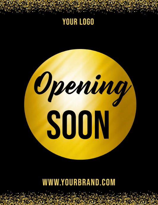
Date, location, and supporting information
A confirmed opening date is one of the most valuable details a business can place on the poster. It converts a vague announcement into a specific expectation. If only a month or season is known, that can be communicated instead. The important point is accuracy: a poster should not imply a final opening schedule when the business has not confirmed one.
Location information is particularly important for physical businesses. A short address, neighborhood, shopping center, or recognizable local landmark can help viewers understand where the new business will be. If space is limited, a QR code can provide a route or map destination while keeping the visible composition uncluttered.
Contact details should be selected according to the purpose of the announcement. A website, social profile, phone number, or QR code can work, but there is rarely a need to include every possible contact channel. Choose the one most useful to the intended audience and make sure it remains legible at the final viewing size.

Choosing the right visual style
A minimalist layout can be particularly effective when the business already has strong branding. A plain background, restrained color palette, large headline, and carefully placed logo can communicate confidence without requiring decorative elements. Minimalism is not simply the removal of graphics; it depends on alignment, spacing, contrast, and proportion.
A more expressive composition may suit businesses that depend on atmosphere. Restaurants can use food photography or illustrations, cafés can use coffee imagery, fashion businesses can use garments or editorial-style compositions, and specialty stores can highlight products associated with the new location. The image should reinforce the business rather than merely fill an empty area.
Color should connect the announcement to the wider brand identity. If the company already uses established colors, the poster should normally remain within that system. For a new business without a mature identity, two or three principal colors can establish a recognizable visual direction. Strong contrast is useful, but excessive color variety can make a poster look less professional.

Business-specific poster approaches
Retail stores and boutiques
Retail opening announcements benefit from a clear business name, a strong product cue, and a concise opening message. Clothing, accessories, home goods, and specialty retail businesses can use product photography, illustrated objects, or carefully selected textures. The visual should communicate the type of store without requiring a long explanation.
A retail poster can also establish expectations around the shopping experience. A short phrase such as “new collection,” “new destination,” or “opening event” may be appropriate when it accurately reflects the planned launch. If an opening promotion has been confirmed, it can be added as a secondary message, but it should not overwhelm the business identity.
For a storefront, physical visibility becomes especially important. Large lettering, strong contrast, and generous margins make the design easier to read through glass or from the sidewalk. A layout that looks attractive on a laptop can become ineffective when reduced to a window sign, so the final physical viewing distance should influence design decisions.

Cafés and restaurants
Food businesses have an advantage because their products can become the visual focus. A well-composed dish, beverage, ingredient arrangement, storefront illustration, or interior detail can immediately signal the category. The strongest food posters usually balance the image with clear announcement typography rather than covering the image with excessive copy.
A café announcement can use warm neutrals, coffee imagery, illustrated cups, or a restrained editorial composition. A restaurant may need stronger food photography or a more dramatic palette. The appropriate style depends on positioning: a casual neighborhood café does not necessarily need the same visual language as a luxury dining concept.
Information should remain concise. A restaurant opening poster might need the name, opening date, location, website, and one short invitation. If a launch event or reservation period is confirmed, that information can be emphasized. Avoid filling the poster with an entire menu or a long description that belongs on another marketing channel.

Service businesses
Salons, clinics, studios, repair services, agencies, and other service businesses often need a slightly different approach. The poster should make the service category obvious while emphasizing the new location or launch. A strong icon, simple illustration, or carefully selected product image can communicate the category without introducing distracting visual complexity.
Service businesses should be cautious about making claims in a launch poster. The announcement should focus on verified information such as the business name, opening date, location, booking channel, and genuine introductory offer. Unsupported promises or exaggerated statements can make a new business look less credible rather than more established.
For appointment-based services, the most useful call to action may be a booking route or contact channel. For walk-in businesses, location and opening hours may be more important. The template should therefore be adapted to the actual customer journey rather than copied without considering how people will respond to the announcement.

Layout principles that make an announcement easier to read
Visual hierarchy is the foundation of an effective poster. The main announcement should usually occupy the largest or most prominent area, while supporting information becomes progressively smaller. Alignment can create structure even when the design uses only a few elements. Consistent left edges, centered blocks, or deliberate asymmetry can all work when applied consistently.
Negative space is equally important. Empty areas give the headline room to breathe and help prevent a crowded composition. Designers sometimes add extra icons, decorative shapes, shadows, borders, and secondary messages simply because a template appears to have unused space. In reality, empty space can be one of the strongest tools for directing attention.
Contrast should be evaluated at the actual size where the poster will be seen. Thin text over detailed photography can disappear, while pale text on a pale background can become unreadable. A solid panel, subtle overlay, or simpler background can protect important information without making the design feel heavy.

Print and digital formats
A poster intended for a storefront and a graphic intended for social media should not necessarily use the same dimensions. Physical posters require attention to viewing distance, paper size, margins, and print quality. Digital graphics may require a different aspect ratio and a larger emphasis on information that can be read on a phone screen.
For print, a high-resolution source is important because enlargement can expose soft edges, pixelation, or poorly prepared graphics. Keep essential text away from the trim area and consider how the final paper size affects readability. If the poster will be displayed behind glass, test for reflections and reduced contrast.
For digital publication, check how the design behaves on small screens. A headline that looks balanced on a desktop monitor may become too small when viewed in a feed. A useful practice is to create the primary layout first and then make deliberate adaptations for each channel instead of shrinking one design repeatedly.

How to adapt a template without losing its professional appearance
The first step is to replace every placeholder with verified business information. That includes the name, logo, date, location, website, phone number, social handle, and any promotional message. Placeholder text is one of the easiest ways for an otherwise polished announcement to look unfinished.
The second step is to simplify. A template may contain more decorative elements than the business actually needs. Remove anything that does not support the announcement. This might mean reducing the number of colors, deleting secondary icons, shortening a paragraph, or replacing several photographs with one stronger image.
The third step is to check consistency with the rest of the brand. Compare the poster with the business logo, website, packaging, signage, social graphics, or other established materials. The goal is not necessarily to make everything identical, but to make the announcement feel like it belongs to the same business.

Common mistakes to avoid
One common mistake is using too much information. A launch poster is not a brochure. If viewers must read a large block of text before understanding what is happening, the central announcement has lost its impact. Move detailed explanations to another communication channel and retain only information that helps the viewer recognize, remember, or act on the launch.
Another mistake is choosing decorative typography over readability. Script and display fonts can be attractive, but they become problematic when used for addresses, dates, phone numbers, or other details that need to be understood quickly. Readability should win whenever decorative styling conflicts with essential information.
A third mistake is failing to test the design in its real environment. A poster should be viewed on a phone if it will be shared digitally, printed at the intended size if it will be displayed physically, and examined from a realistic distance. These tests often reveal problems that are invisible while editing at full-screen size.

Using imagery without overwhelming the announcement
Images can establish context instantly, but they should have a clear purpose. A bakery may benefit from bread or pastry imagery, while a furniture shop may benefit from a clean interior or product composition. The image should make the business category more recognizable and support the emotional direction of the brand.
Image placement also affects typography. A detailed image behind a headline may require a dark or light overlay, a solid text panel, or a quieter crop. Alternatively, the photograph can occupy one part of the composition while the announcement sits in a clean area beside it. This separation often creates stronger readability than placing text directly over a busy image.
Consistency is especially important when several posters are created for the same launch campaign. Reusing the same visual language while changing individual messages can make a campaign feel coordinated. Variations might highlight the date, location, countdown, product teaser, or launch event while retaining the same typography and color system.

Practical Solution
Start by writing the smallest possible content set: business name, opening message, date or timeframe, location, and one action. Do not begin by decorating the page. First establish the information hierarchy. Decide which element should be seen first, second, and third. This prevents the design from becoming visually attractive but informationally weak.
Next, choose one visual direction that matches the business. A boutique might use elegant typography and neutral tones, a café might use warm photography, a technology business might use geometric shapes, and a neighborhood shop might benefit from a friendly illustrated style. Select one primary background treatment and one supporting visual system rather than combining several unrelated styles.
Finally, test the finished layout in context. Review it at full size, at thumbnail size, from a realistic viewing distance, and against the environment where it will appear. Verify every date, address, contact detail, and brand element. Remove anything that does not contribute to recognition or action. The final design should feel clear enough to understand quickly and distinctive enough to remember later.

Examples of effective design directions
A bold typographic approach is useful when the primary objective is immediate recognition. Large lettering can dominate the composition while the business name and date occupy smaller supporting positions. This approach is especially suitable when the brand already has strong visual recognition or when the poster needs to work from a distance.
A product-led approach places the business category at the center of attention. Food, clothing, cosmetics, furniture, or specialty goods can become visual anchors. The announcement then works as a frame around the product rather than competing with it. This is often effective for businesses whose products have a distinctive appearance.
An event-led approach is appropriate when the opening itself is a defined occasion. In that case, the poster may emphasize a date, time, venue, invitation, or special launch activity. The hierarchy should still make the business identity obvious so viewers remember who is opening and why the event matters.

Choosing typography, color, and spacing together
Typography, color, and spacing should be treated as one system rather than three independent decisions. A heavy typeface needs sufficient surrounding space, while a delicate typeface may need stronger contrast. Bright colors can require larger areas of neutral space to prevent visual fatigue. When these variables are balanced together, even a simple layout can look deliberate.
Color contrast is particularly important for accessibility and practical readability. Do not rely only on hue differences to separate information. Lightness, weight, size, and placement can reinforce hierarchy. This is especially useful when the poster needs to be readable by people with different visual abilities or when it will appear under changing lighting conditions.
Spacing should be consistent around related elements. The business name can sit close to the logo, while the opening date can be grouped with the location. Unrelated information should have more separation. This grouping helps readers understand relationships without requiring borders around every section.

When to use a simple poster instead of a detailed promotional design
A simple poster is often the better choice when the opening date is still being finalized or when the business name itself is the main message. A restrained announcement can be updated easily as information changes. This is preferable to creating a highly detailed design that quickly becomes inaccurate.
Simple designs are also useful for repeated campaign stages. An early teaser can introduce the business, a later poster can reveal the opening date, and a final announcement can provide opening hours or a launch invitation. Maintaining a consistent visual system makes these stages feel like parts of one campaign.
Detailed designs are more appropriate when there is a confirmed event, a strong product story, or a specific promotional reason to communicate additional information. Even then, the hierarchy should remain clear. More content should not automatically mean more visual complexity.

How to evaluate a finished poster
Begin with a five-second test. Look at the poster briefly and then ask what you remember. Ideally, you should be able to identify the business or category and understand that an opening or launch is approaching. If the only memorable element is a decorative background, the hierarchy probably needs revision.
Then inspect the factual layer. Check spelling, capitalization, dates, times, addresses, contact information, website details, and QR codes. These small errors can undermine trust because a customer may use the poster as a practical source of information. Never assume placeholder information has been replaced simply because the design appears complete.
Finally, examine the poster at its actual intended size. Check contrast, type size, image sharpness, margins, and overall balance. A design is finished when it works in the environment where customers will encounter it, not merely when it looks attractive inside the editing workspace.

Reference Examples
A soon business poster Template can take many visual forms while retaining the same essential purpose: announce an upcoming business launch clearly, establish a recognizable identity, and give potential customers a reason to remember the opening. Useful references show how headline scale, image selection, color contrast, dates, logos, location details, and calls to action can be arranged without making the design unnecessarily complicated. Comparing several layouts is especially helpful when deciding whether a new business should use a minimalist, editorial, colorful, product-focused, or event-oriented direction.
The following references provide different ways to evaluate a soon business poster Template in practice. Some emphasize large typography, while others use product imagery, storefront illustrations, geometric shapes, or celebratory graphics. They can help readers recognize which elements create hierarchy, which details should remain prominent, and how a business announcement can be adapted for different industries and visual identities. The examples are references for design evaluation rather than claims that any particular business, date, address, or promotional offer shown in the artwork applies to the reader.

Bakery Shop Opening Announcement
Source: Canva
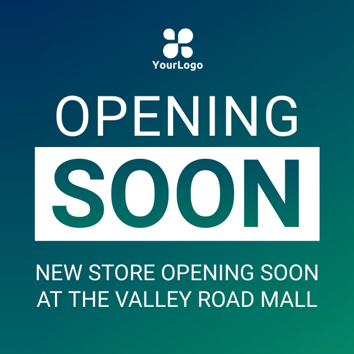
New Store Opening Announcement
Source: PosterMyWall

Grand Opening Announcement
Source: Pinterest

Opening Soon Announcement Template
Source: PosterMyWall
Bright Yellow Minimalist Coming Soon Poster
Source: DesignWiz
Warner & Spencer Coffee Shop Opening Announcement
Source: Canva
Boutique Opening Announcement
Source: Rawpixel
Restaurant Opening Soon Promotion Flyer Template
Source: DesignWiz
Opening Soon Promotional Template
Source: PosterMyWall
